What Works for Children’s Social Care – Brand identity to coincide with the public launch of a new organisation

What Works for Children’s Social Care (WWCSC) improves the lives of children by setting standards and generating the best research in children’s social care.
We worked with WWCSS in partnership with Forster Communications on a brand development process. Forster led on the work on the core brand strategy and we were commissioned to translate this into a comprehensive visual identity.
Setting the direction
WWCSC are a newly established organisation, and a part of the government’s What Works Network. Working in close collaboration with both their team and Forster Communications, our initial phase of exploration work followed two quite distinct visual directions that also included possible alternative organisational names.
Once the chosen visual approach was settled on we refined the asset suite and built the guidelines to work across a range of channels.
A visual representation of the organisation
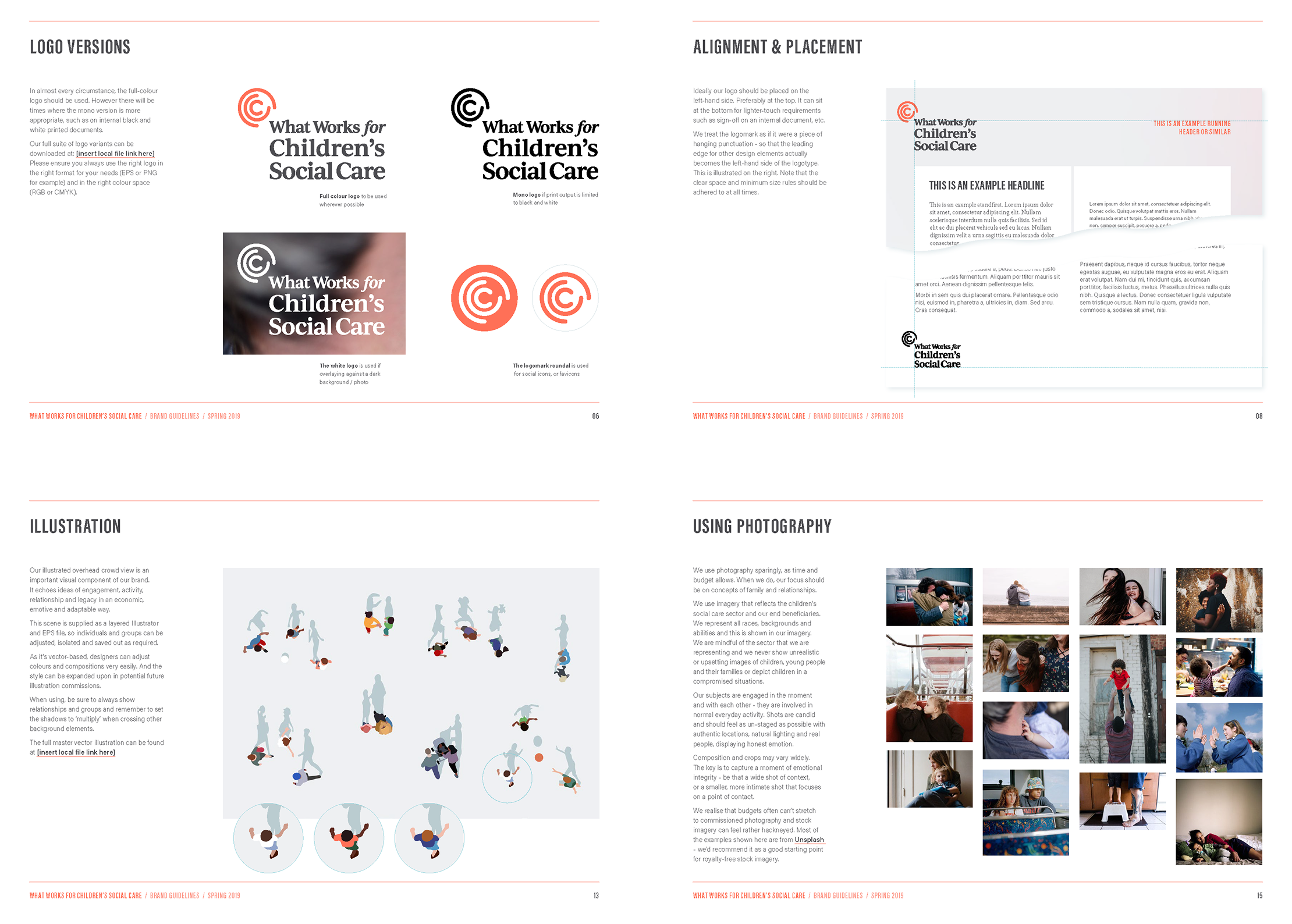
Speaking to ideas of both protection and repercussion, the hugging letter c of ‘Children’s Care’ forms the ripples of the logo mark. This is isolated as a shorthand social icon and then in lock-up with the full logotype.
The type scheme offsets the pragmatism of the sans serif Acumin family with the softer, and more approachable Minion. With colour, we opted for a shifting soft palette of gradients to bring some light and texture and hope into the more urban grey.

A library of distinctive assets
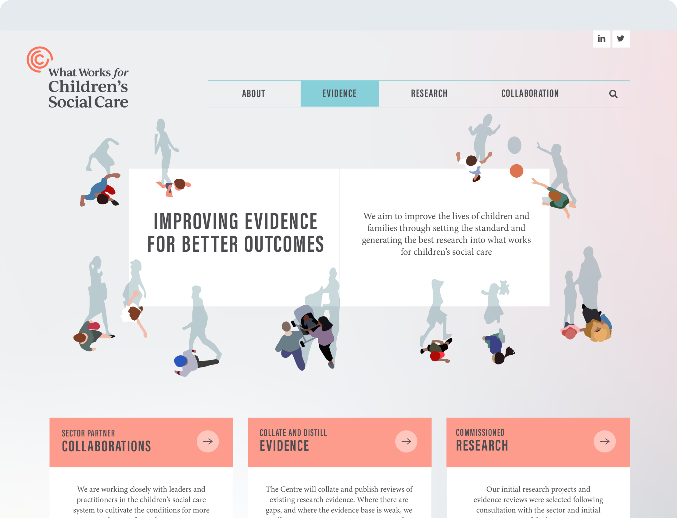
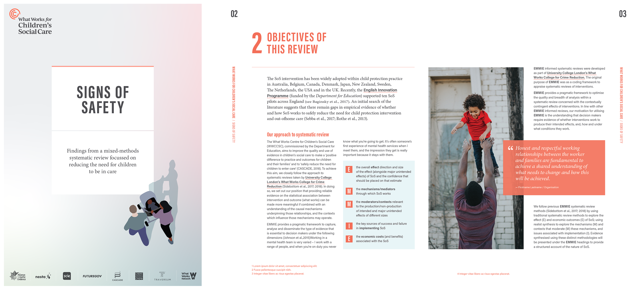
Hoping to sidestep what can become unhelpfully sentimental stock imagery in this sector, we developed a top-down, long-shadow library of illustrated characters that could be rearranged as required for materials.
A small selection of very carefully curated candid stock image and some art direction suggestions completed the overall picture, while application examples for website, print reports, social media, and video captions were also delivered as part of the project.