Ark
Humanitarian Leadership Academy – Brand strategy and identity system for flagship leadership programme
2022

The Humanitarian Leadership Academy (HLA) enables people around the world to prepare and respond to crises in their own countries by ensuring humanitarians and volunteers can access high quality, contextualised learning. It also acts as a humanitarian capacity strengthening unit within Save the Children UK.
With a growing reach of over 430,000 people worldwide, HLA had made a number of significant changes over recent years, and had identified a need to analyse their market position and refresh their brand to ensure that it appealed to the needs of both that existing user base and new customers.
Analysis and strategy
Our long-term collaborator Kat Knight stepped in to lead on brand strategy development – conducting competitor analysis, individual internal and external stakeholder interviews and chairing a large group strategy workshop. This was during the second Covid lockdown, so we used the Miro platform in an adapted number of exercises to flesh out our understanding of audiences, USPs and brand personality.
This resulted in a brand strategy document and SWOT analysis, which helped HLA find clarity around their position moving forward, and allowed us to create consistency and credibility across brand persona, hierarchy, identity and messaging.
Clarity and simplicity
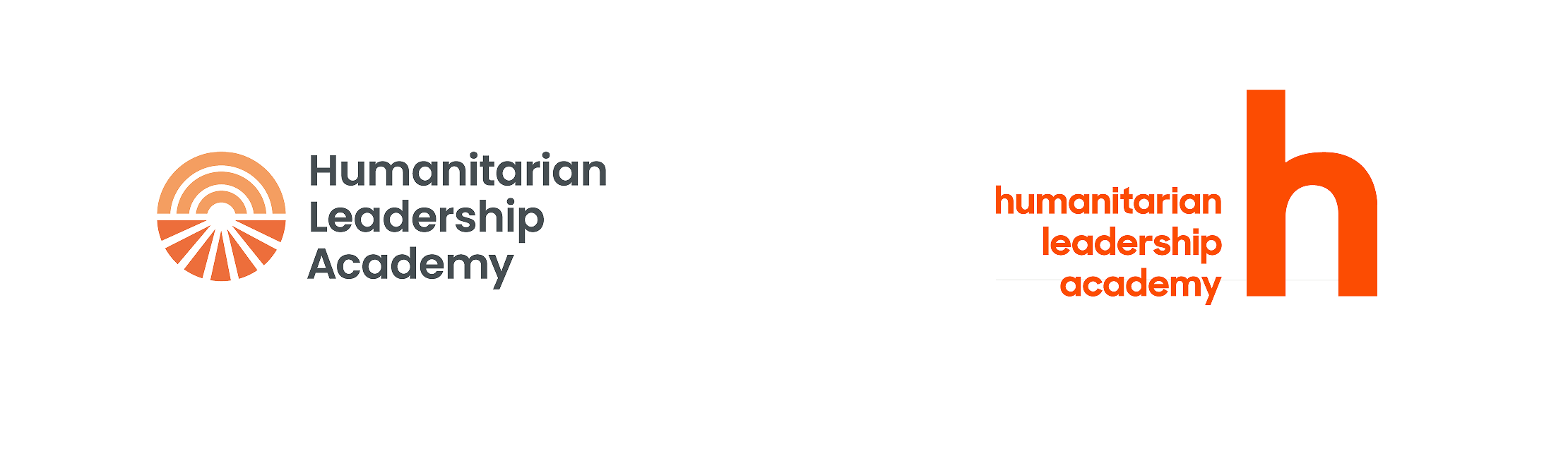
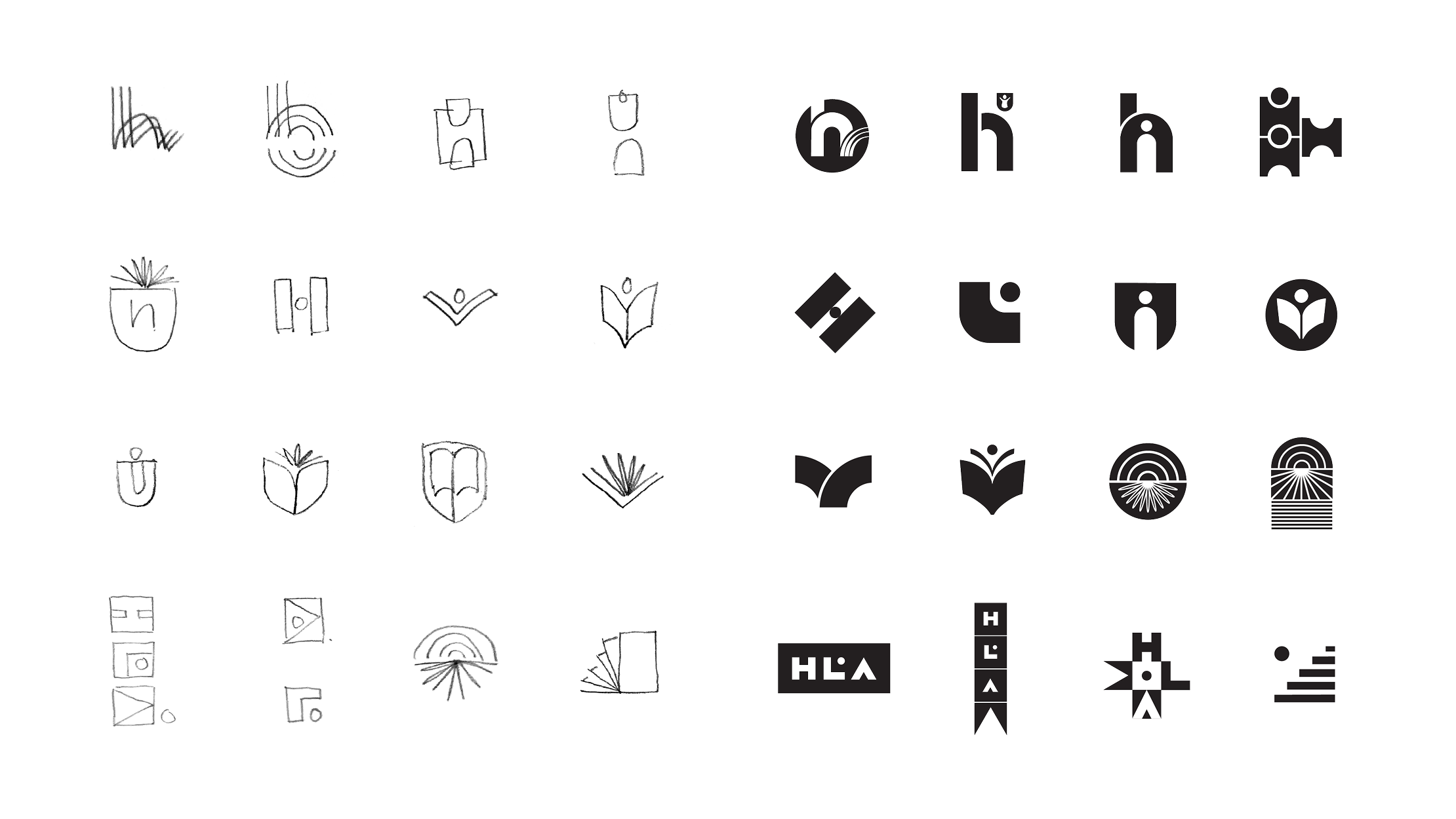
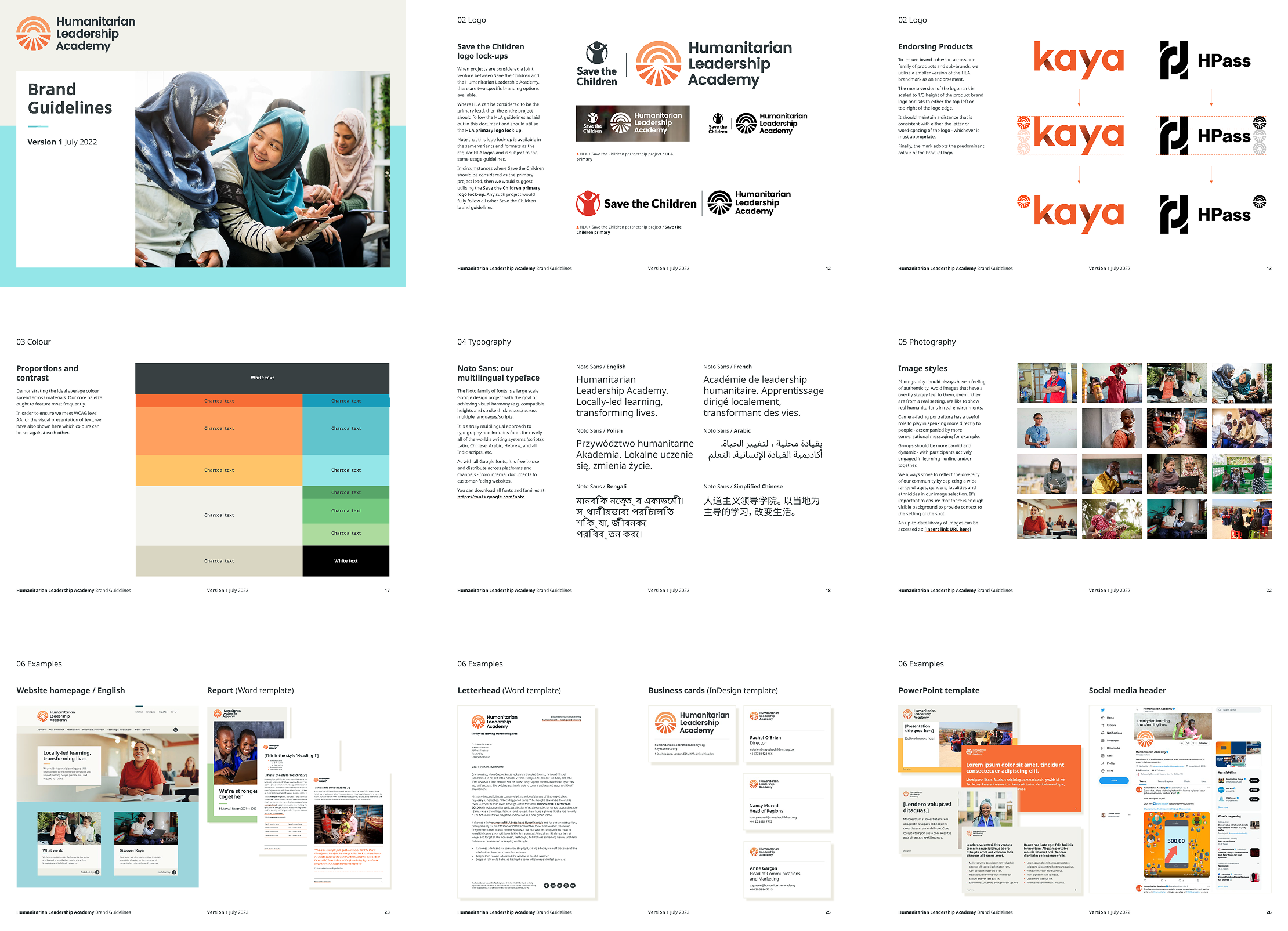
Through design exploration, we arrived at a key recommendation to move well away from the previous logomark – a stylised lowercase ‘h’. As an organisation with a global reach, serving multiple languages and writing systems, this simple letter didn’t always make sense to audiences.
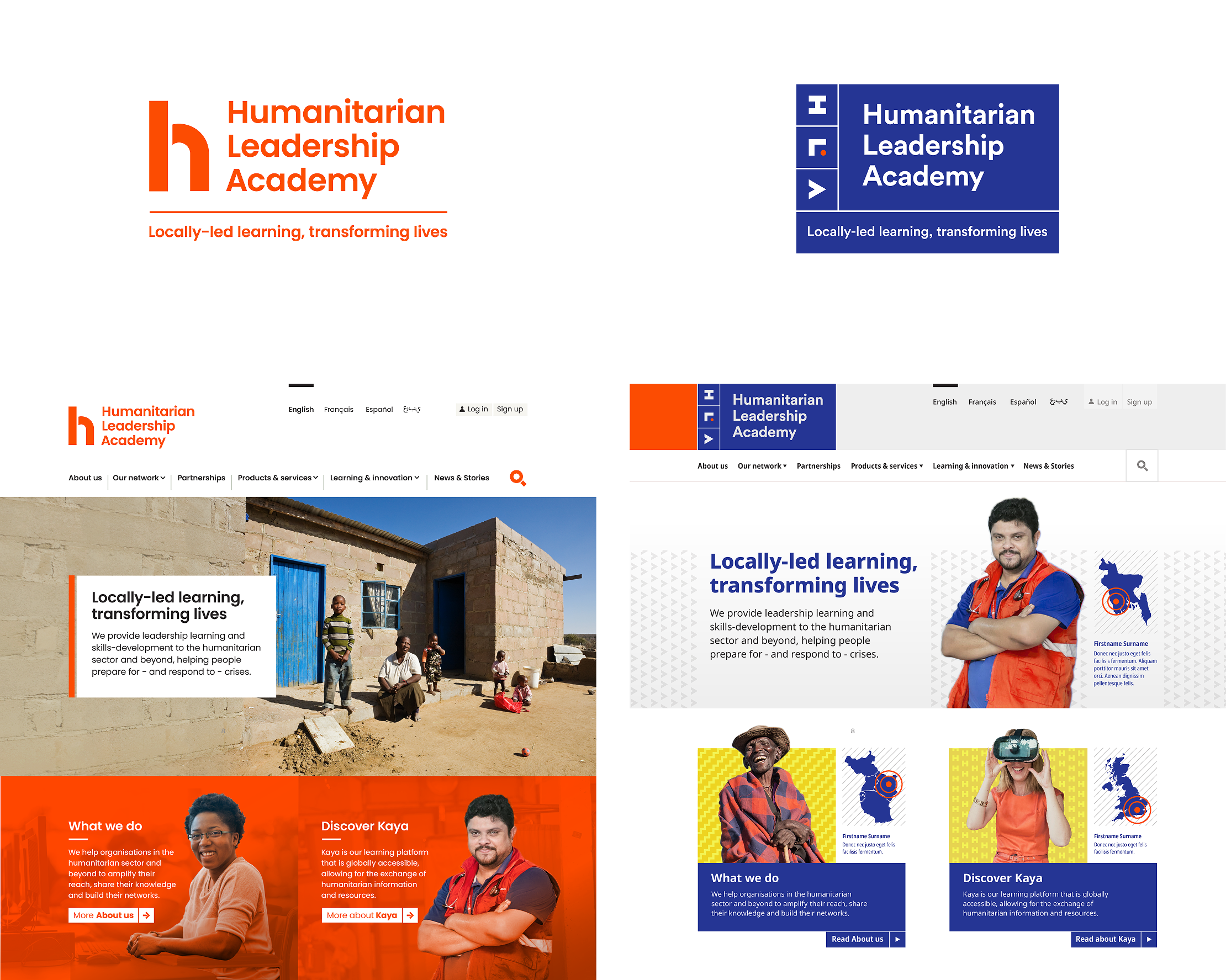
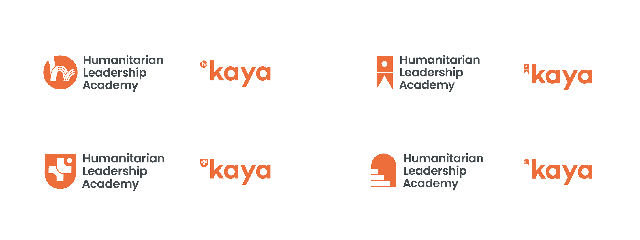
Typographic consistency was a challenge due to the lack of language support in even some of the most multilingual of typeface families, and brand hierarchy was addressed to regain control over an expanding product suite (such as ‘Kaya’, shown here) that was starting to drift away from the core brand.
Consistency and sustainability
Our refinement work led us to the introduction of a new stylised mark that reflected the organisation’s values, reach and ambition. It also needed to be bold and simple enough when reduced in size to endorse product brands, and to reproduce well on often poor quality and outdated local printing facilities.
The Google Noto font project was an ideal fit to future-proof their approach to typography: an ambitious endeavor that currently supports more than 1,000 languages and over 150 writing systems. Coupled with an expanded and softened palette and a photographic art direction that emphasised positive collaborative learning at a local level, we were able to deliver a complete brand toolkit ready for roll out across the organisation.
We had a great experience working with Darren and the Bureau team on our rebrand project. They truly captured our vision, aligning it with our core values and mission. Their creativity and strategic approach helped us build a stronger connection with our audience and elevate our brand to the next level.